
Vlog arriba, blogpost abajo / Vlog above, blogpost below
En este vlog muestro lo que recibí por correo (relacionado con ilustración). Luego hablo de lo que me inspiró hacer la tarjeta de Navidad de la que hablé en el video pasado. Se puede ver el proceso en time-lapse y el resultado, utilizando por primera vez acuarelas líquidas Ecoline. Espero les guste!!
Feliz Navidad atrasa a todos y feliz Año Nuevo!!
In this vlog I show what I received on my mail, which is illustration related. Then I talk about wanting to do a Christmas greeting card and what inspired me to do it. You can see the process in time-lapse and the result, while using for the first time Ecoline liquid watercolours. I hope you like it!!
Merry late Christmas to everyone and Happy New Year!!
Correo Feliz / Happy Mail
Sobre Illustoria / About Illustoria
Illustoria es una revista estadounidense independiente de niños que descubrí por Instagram. Me gustó mucho el énfasis que ponen en ilustración a la utilización de cada edición, además del contenido y la temática enfocada en cada número. Es una revista diferente porque fue diseñada por personas creativas que vieron una falta de revistas con calidad, contenido y gráfica interesante para niños. Sus fundadores Joanne Chan y Mark Rogero han ido creciendo desde hace unos pocos años hasta llegar a tener 5 números y muy próximamente el número 6 estará disponible. Las publicaciones giran en torno al juego, un poco de cultura DIY, al contar historias por medio de cuentos cortos, reportajes y comics, que al mismo tiempo pueden ser disfrutadas por adultos.

Illustoria is an independent children's magazine from the US that I discovered by Instagram. I liked a lot the emphasis they put in illustration in each edition, besides of the content and theme focused on each number. It is a different magazine because it is designed by creative people that saw a lack of quality magazines concerned about content and good use of graphic for children. Their founders, Joanne Chan and Mark Rogero have been growing since few years ago until having 5 issues and the number 6 coming soon. The publications relate games, a little bit of DIY culture, storytelling by short stories, articles and comics, which at the same time can be enjoyed by adults.
Haciendo Una Tarjeta de Navidad /Making a Christmas Card
Sobre las Acuarelas Líquidas Ecoline / About Ecoline Liquid Watercolours

Desde hace algún tiempo quería comprar estas acuarelas porque sabía que los colores eran muy brillantes, distintos a las de las demás marcas. No estaba segura si comprar Ecoline o Dr Ph. Martin's y lo que no me convencía de las segundas era que no son tan transparentes como pienso que debería ser una acuarela. En Ecuador no venden las acuarelas Ecoline, a menos que uno compre al contrabando y las Dr Ph. Martin's se las encuentra en una tienda en Quito, pero son demasiado costosas. Aproveché que mi hermano estuvo en los Estados Unidos por unos días y me hizo el favor de comprar un paquete de 10 colores.
For a while I wanted to buy these watercolours because I knew their colours were very bright, different from other brands. I wasn't sure if I should buy Ecoline o Dr Ph, Martin's and that what it didn't convinced me was the colours of the second one weren't as transparent as I think watercolours should be. In Ecuador you cannot buy Ecoline watercolours, may you will find it on the black market and Dr Ph. Martin's are sold in one store in Quito, but they are very expensive. I took the advantage that my brother was in the US and I asked him to bring me a pack of 10 colours.

Los colores eran muy brillantes, vistosos y se mezclaban maravillosamente. Los efectos con el agua eran los mismos que el de una acuarela normal y si uno quiere conseguir tonos blanquecinos como las acuarelas convencionales, solo tiene que poner más agua. El proceso iba bien hasta que decidí poner una capa de agua con un poco de color para obtener el efecto de reflejo de vidrio, pero conservando la pintura de la primera capa. Realmente para mi como experiencia fue muy triste al ver que la pintura se reactivaba con el agua y dañando así mi dibujo. Después de lo que me pasó vi en la página web de la marca que esta acuarela no es a prueba de agua, pero en cada envase no describía esta peculiaridad, ni siquiera había esta información en el paquete en el que vino.
The colours were very vibrant, strong and the mixed marvellously. The effect with water were the same as a conventional watercolour and if one wants to get tones as normal watercolour, you just have to add more water. The process was going according to plan until I decided to put a layer of water with a bit of colour to get the effect of window reflection, but preserving the first watercolour layer. Actually for me was a very sad experience to see that the paint reactivates with water, and in this way damaging my painting. After what happened I went to their website and it was written that this material wasn't water proof, but on the water there wasn't any information about this, not even in the original package.

Sé que fue mi culpa porque tal vez no experimenté a fondo con el material y cometí el error de hacer algo serio o formal con algo que no estaba familiarizada. De todas maneras pienso que cada tipo de pintura tiene un nombre debido a la cualidad de su constitución. Por ejemplo los óleos se caracterizan por ser brillantes y al mezclarse y difuminar es algo relativamente maleable porque su secado es lento o con el acrílico que es un poco más mate que el óleo, se parece más al plástico, pero con este material hay que ser rápido porque se seca en pocos minutos o incluso segundos. Creo que si le das el nombre de acuarela a un determinado material, debería seguir las mismas cualidades que tiene una acuarela normal, sino cumple con estas condiciones debería tener otro nombre y ser claro sobre las limitaciones que este particular producto tiene. Un ejemplo de pintura que especifica sus condiciones son los Holbein Acryla Gouaches, que es una mezcla entre acrílico y gouache, donde el material tiene características de ambos medios y su naturaleza está incluso explicada en el nombre.
I know it was my fault because this time I didn't experiment the fullest with this material and I committed a mistake to do something serous or formal with something that I wasn't familiar with. Anyway I believe that each type paint should have its name according to their constitution and condition. For example, oils are known for being shiny in colour and very flexible for blending due to their long term dry ability or with acrylics that are a little bit more opaque than oils and have like characteristics more similar to plastic, but you have to be fast because they will get dry in few minutes or even seconds. I think if you give the name of watercolour to a determined material, it should follow the same qualities as a normal watercolour or if it doesn't follow these, it should have other name and it is a need to put their material limitations clear. An example of a paint that specifies its condition is the Acryla Holbein Gouache, which is a mixture between acrylic and gouache, where the material has characteristics of both mediums and the condition of its nature it is even explained on the name of the product.
De todas maneras los tonos que se pueden lograr con las pinturas Ecoline son variados y tienen vida. Personalmente me gustan y pienso utilizarlo más en mis trabajos futuros, pero de ahora en adelante tendré más cuidado con esta primera experiencia.
Anyway the tones that you can get with Ecoline are very varied and they take life over paper. Personally I like them and I think I will use it for my future projects, but now I will be more careful because of this first experience.
Consejos Para Hacer una Tarjeta de Navidad / Tips to Make a Christmas Card
- Tratar de hacer la tarjeta con anticipación, puesto que siempre surgen imprevistos en el proceso y acontecimientos que no podemos predecir.
- Pensar en el texto al mismo tiempo que se piensa en la imagen. Muchas veces cuando trabajo, lo que predomina más es la imagen, pero a la hora poner texto no encuentro el espacio indicado o los colores del fondo tienen tantos detalles que no permite que se aprecien las letras.
- Si se puede, utilizar un recuerdo relacionado con lo que queremos hacer. Pensar en experiencias personales hace de nuestro trabajo único, pero al mismo tiempo universal porque son experiencias basadas en sentimientos y los sentimientos es lo que nos conecta con los demás.
- Tener en cuenta el formato. Si se quiere que solo sea digital o si va a ser impresa pensar si va a ser como una postal o va doblarse por la mitad. También las medidas y la ubicación, si es horizontal, vertical o si queremos que sea cuadrada. Y si es impresa pensar en los tamaños de los sobres disponibles, pero incluso uno puede ser creativo y construir el suyo propio.
- Si se trabaja por capas, escanear cada capa terminada, por si ocurre algún accidente. De igual manera guardar el archivo en formato PSD para poder hacer cambios posteriores.
- Trabajar con un material con el que nos sintamos cómodos. Pero si se quiere experimentar, darse un tiempo con el material, porque como ya saben, pueden pasar desastres.

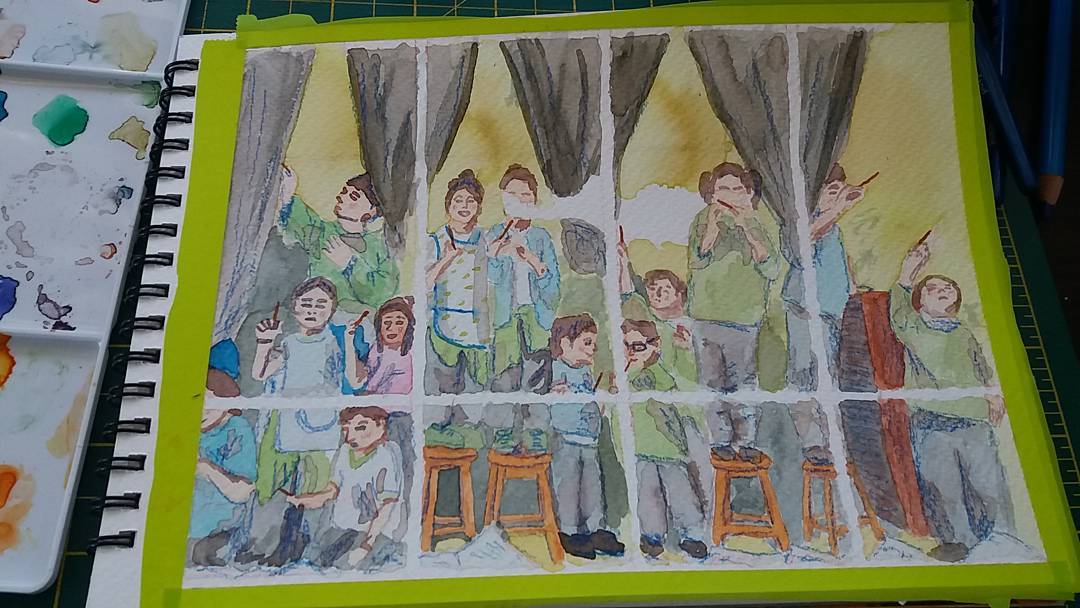
Mis amigos con mis tarjetas de navidad, 2016 / My friends with my Christmas cards, 2016
- Try to make the card with lots of time in advance; you never know what can happen. So this is to prevent the existence of any accident on the way.
- Think about the text and the image at the same time. Most of the time when I am working, I give more attention to the image and at the end I cannot find a space to put the text or the colours of the background have so many details that it is difficult to read the letters.
- If you can use a memory related to what you want to say, do it. This will make your card unique, but at the same time universal. If we work over experiences that are based on feelings or how we felt in certain moment we will feel connected, because feeling is the thing that makes us relate to each other.
- Take the format in consideration. If the card is going to be just digital or printed. If it is going to be printed like a postcard or is it going to be fold on the middle. The thin about sized and position, is your composition is going to work more as landscape or may be portrait or even squared. Also check the envelopes sizes you can find, and if there aren't any under the conditions you want, be creative and make your own.
- If you work by layers, scan every layer just in case there is an accident that we can't predict. Also save your work in PSD format so you can change your image if you want in the future.
- Work with a material that you feel familiar with. Or if you want to work with a new material give yourself a bit of time to experiment until you can think you got it.

Espero les haya gustado esta publicación y espero que tenga un Feliz Año Nuevo!!
I hope you've liked this blogpost and I hope that you have a Happy New Year!!
Links:
Illustoria
Illustoria instagram
Music: Santa is Coming to Town, cover by Keum Bee, Alfie Hole and Hwansu Kang: https://soundcloud.com/keumb/santa-claus-is-coming-to-town